Creating for creatives
Written by
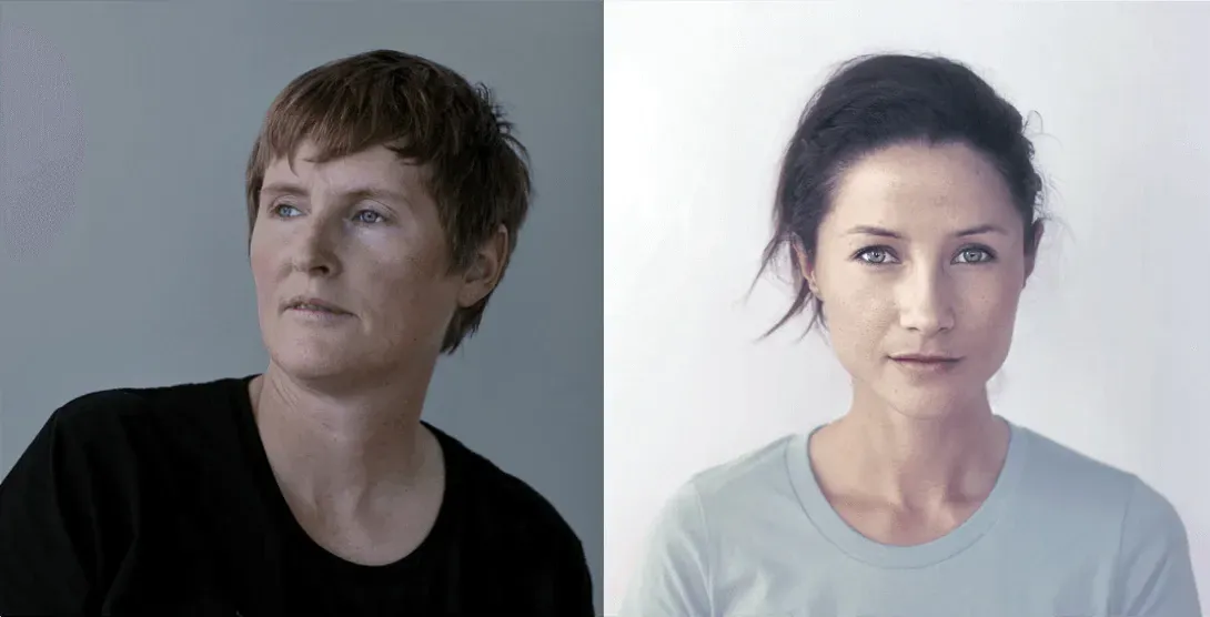
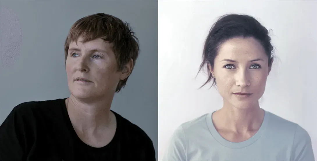
Threaded Studio creative directors Fiona Grieve and Kyra Clarke have a passion for working with businesses in the creative communities and were a perfect fit to refresh and retell The Big Idea story. They tell us how they paid respect to the past while forging new pathways into the future.
"We wanted to create a brand system with an individual language – using magnetic colour and linear forms to respond to a dynamic community. We wanted a system that was interchangeable, connected and responsive to the land of the long white cloud, the lakes and oceans surrounding us in the Pacific, while also signifying The Big Idea's role in connecting and creating networks, communities, knowledge, visibility and opportunities within the creative industries."
Tell us a bit about yourselves and your creative backgrounds?
We met at Design School in Auckland, Kyra was completing a Bachelor of Design (which she completed with Honours in 2005) and I was Head of the Visual Communications Major. At first we started doing client work together and one summer Kyra conceived and launched the first issue of Threaded Magazine. When the semester resumed we critiqued the first issue together and our partnership and creative roles naturally developed from there. We have complementary capabilities and are very collaborative, to the point we can quickly respond to each others ideas and input on projects. Kyra overseas the project management and creative process, she has a fine eye for technical execution and production and Fiona focuses on research, content and conceptual direction.
Tell us a bit about Threaded Media, the magazine and studio?
Our studio is based in Auckland, New Zealand with an outpost in Washington DC, USA. We established the studio in 2007 - You could say we are a studio of two halves’ with a focus on client-based projects, from print, web and digital, branding and identity, packaging and marketing campaigns to our ongoing international curated editorial design project, Threaded magazine.
This is a great time of the year for us as we are about to launch Ed 19 The Cultural Capital Issue.
How did you get involved in The Big Idea re-launch?
Following my placement on Art Venture, a creative entrepreneurship award I received in 2012, I met Elisabeth Vaneveld and was introduced to The Big Idea. At the time our studio was housed within Auckland co-working space the BizDojo so we were destined to meet and interact with other like minded creatives. Julian Andrews [an adviser to The Big Idea Trust Board] was a strong advocator for Threaded Studio giving The Big Idea a fresh new look and re-curating the look and feel of their online space. Both Fiona and I jumped at the chance to work with clients in the creative sector again.
The Big Idea is a trusted organisation, how did you approach the redesign to respect the past while taking forward a fresh message?
Aotearoa New Zealand is a lively, powerful intersection point of culture, history and society and it was very clear from the outset that the The Big Idea takes pride in a role that serves as caretaker, connector and enabler for the creative sector here. We really valued their existing brand attributes and identified an opportunity to align their strategic direction with a new brand system that pays respect to the past while also forging new pathways into the future to connect with new possibilities and support innovation, creativity and enterprise.
What did the process involve?
Our creative process always starts with research, inquiry, collation and clarification - in a sense the outcomes are only going to be as robust as our first phase. The Big Idea were very proactive and had a deep understanding and articulation of their organisation, role and strategic direction. We were able to add to this and work together to define positioning, voice, story and brand mark characteristics. Once we establish clear deliverables and agree to a framework we work very closely with our clients, we like the fact that design is a collaborative process.
Any extra pressure creating for creatives? What were the other challenges and rewards of this project?
Critique is a significant aspect of our creative process and one we welcome - this is a significant phase of collaboration. With regard to feedback, members of The Big Idea Board had clear points of view and were able to communicate a strong rationale rather than just a visual opinion in concept presentations. We are often working with design partners when a big website build is required so we are open to the sharing of ideas, creative exploration and concepts. The overall collaboration between The Big Idea team, Sparks Interactive and other contributors was enjoyable and the outcome reaffirms this.
The previous logo integrated a mattang into its design. The new logo is a word-mark. What's the story?
In the Pacific and in Maori mythology, legend has it that a spiritual guardian (a bird-like figure), is a custodian over our people, air, waters and land. We resonated with this story as it responds to the role that the The Big Idea occupy as creative caretaker, connector and enabler. From the outset we wanted to the convey the monumental scope and role of the organisation in forging new pathways into the future to connect with new possibilities and support innovation, creativity and enterprise. We think that the typographic system allows a quiet authority, that operates both spiritually and pragmatically to underpin the brand and form a link to this story.
What other elements of the story that underpins The Big Idea (via the mattang and the navigation metaphor) have you brought into the new design and how?
The new brand mark and system was inspired by our history, by a sense of place, culture and our individual and collective desire to connect with each other. Each of the icons within the word-mark are used to highlight ‘the space in between’, as it relates to people within relationships, industries, generations, collaborations, or simply between creative and artifact. We also identified ‘the space in between’, within our environment - air, sky, land, and water. It’s a dynamic system.
Tell us about other aspects of the design, including the different colours.
We wanted to create a brand system with an individual language – using magnetic colour and linear forms to respond to a dynamic community. We wanted a system that was interchangeable, connected and responsive to the land of the long white cloud, the lakes and oceans surrounding us in the Pacific, while also signifying The Big Idea's role in connecting and creating networks, communities, knowledge, visibility and opportunities within the creative industries.
In general, what are your top tips for organisations considering a redesign?
It's really important to choose the right design partner for you and your business!
Value design - spend some time evaluating the value that design could offer your business whether it’s from a financial market share or new product/service position, or has a sustainability focus; there are some great brands, products and services that prove this truth!
And lastly, provide as much context as possible for the design project and be as thorough and active as you can in the discovery and design research phases.
What’s your big idea for 2016?
We want to know and be known - we want to be authentic and present in our relationships and creative process with every one of our clients and continue to enhance the spirit of collaboration within each issue of Threaded magazine. We are constantly reminded of how much more we can learn and develop both individually and collectively - we don’t want to miss a thing!